When it comes to layout and design, artistic appearance isn’t everything. The look of printed magazine and books is appealing, and in earlier times website emulated that style.
It still can be done with older WordPress themes and on sites such as Issuu.
There is a downside to making your website posts and pages look like magazine pages. That is the wide use of smartphones and tablets to roam the web.
Here is an old Issuu publication as seen on a large monitor and on a smartphone.


Note how the layout, the design, is exactly the same on the big screen and on the little screen of the phone. Unfortunately, the text is hard or impossible to read on the tiny screen even though the resolution may be enough.
Adaptive WordPress themes, pretty much all the newer themes, support readability on smaller devices by changing the font size. Text shifts around the illustration and the images may be shown full screen width.
This example here shows screen clips from the prior post in this series. The article as shown on a large monitor is on the left and the way it looks on a iPhone is shown on the right.


Keep this in mind when layout text and illustrations. The primary text blocks and Image blocks can achieve a great deal of design options.
There are other blocks that provide additional options.
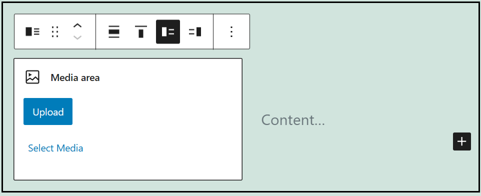
The Media & Text block allows setting an image either on the left or right of text. In this it is similar to using the Image block set either left or right of text. However, it shows text in the block in a column style. That may be useful at times.
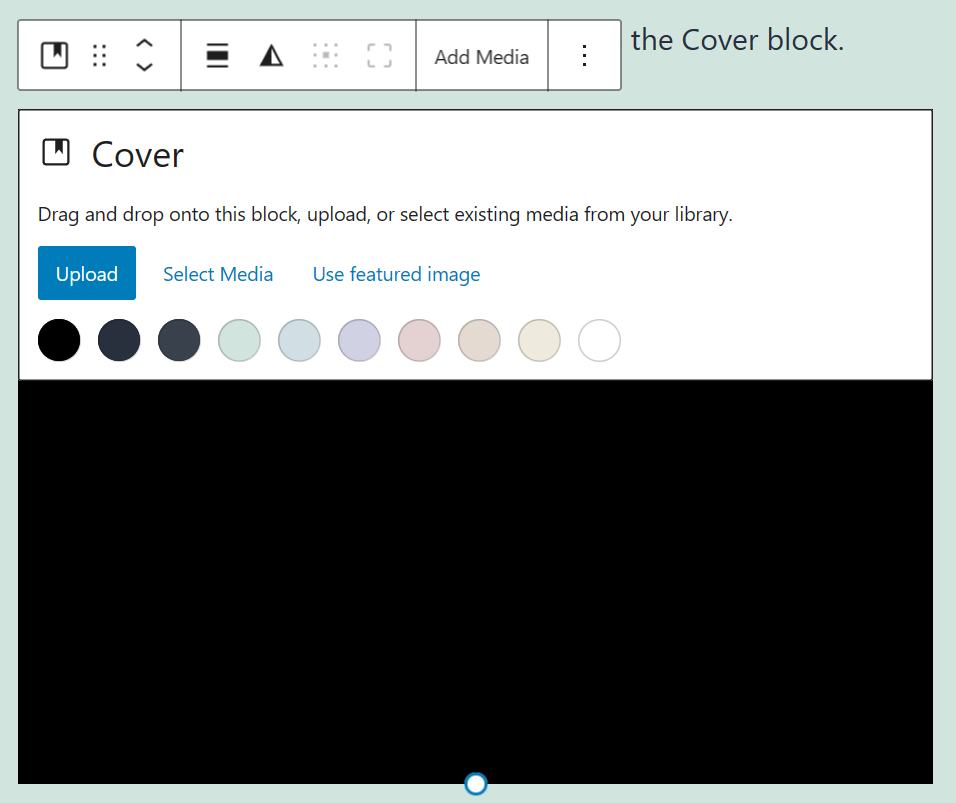
Another block that has interesting potential is the Cover block.
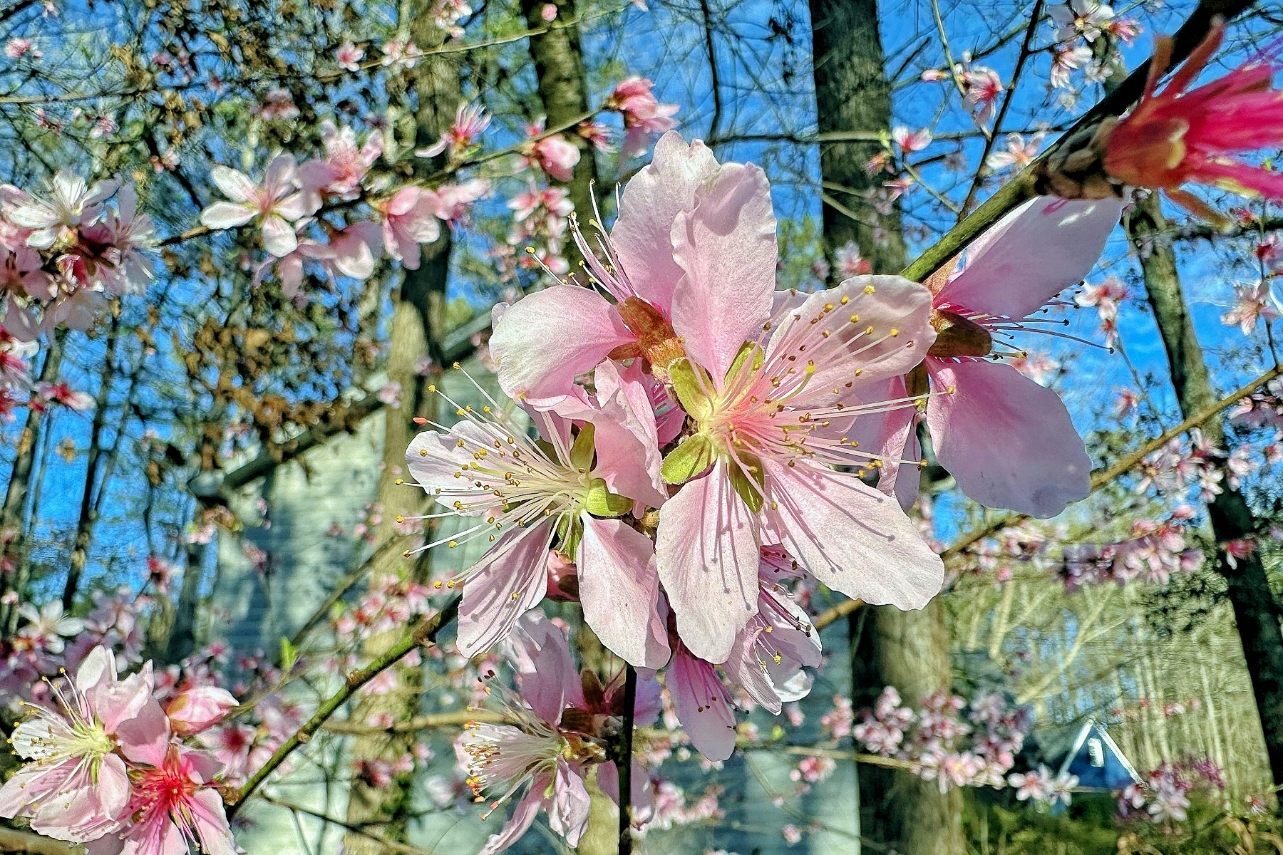
Spring is here!
The Cover block allows text being set over an image. The image can also be darkened to allow the text to stand out.
Then there are Patterns – but we will leave those are for another article.